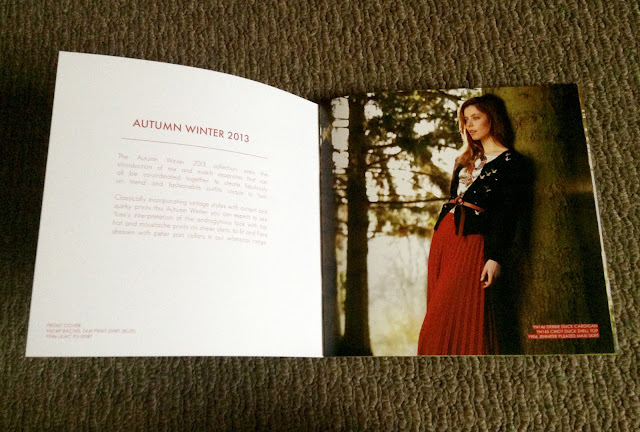
Magazine example
Here, my eyes go to the information and picture of the girl in the outfit.
When I wasn't looking for whitespace the first time I glanced through the pages.
I didn't realise the precise placement is. Everything is even and lines up.
Shop front/billboard example
All you think is "the big sale" when you see this sign.
The rest of the billboard space carries little meaning other than the striking red that grabs attention.
Billboard example
I love the design structure in this billboard.
The dark background shows off all the information to you.
Website example
A beautifully designed website, where everything is 'just so'.
Makes you think highly of the brand, product or company :)
TV example
I notice how sit-coms are structured, with the plain walls, placement of props and furniture.
The set is designed to frame the actors and though it plays a crucial part in the show.
You aren't watching the walls and the set.
But the show wouldn't be the same without the cool purple apartment :)
 |


No comments:
Post a Comment