I enjoyed researching examples in this learning activity :)
Magazine layout
Here is an example of a magazine layout using the negative space to the looks advantage.
The whole space filled with the water and white background to the left.
It gives the design a nice flow that suits the mood.

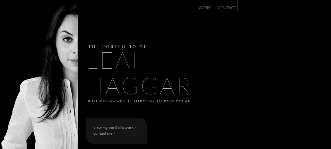
Website design
This website design has so much negative space involved.
Gives the impression of clean and profressional.
The black space fills up with the portfolio work while the artists picture remains fixed.
Artchitecture
I loved looking at the pictures of this amazing Japenese modern home.
Your eye just follows along the walls, to the edges of the building.
The angles are visually amazing while at the same time the building incorporates so much space.
http://www.trendir.com/house-design/open-air-homes-modern-architecture-incorporating-negative-space.html

Nature
Behind the gorgeous Eagle, we see a beautiful landscape.
The photographer using both the background and foreground to make a beautiful picture,
shot at such an angle so that we can appreciate both!

Street signage
Road signs are important in road safety as we need to be able to see them.
They must be both clear and legible.
Using negative space to frame the message/image and to pop the words/image out.
Helps the viewer to focus on the signs information.

Vehicle signage
We see the logo on the car door and the rest of the companies branding through the coloured
areas on the rest of the car.

Film example
The first thing that came straight to mind thinking about films, are the CUBE movies.
The actors are definitely the point of focus in these movies, yet their surroundings are a huge aspect
relating to the films plot. In both visual and practice, the space is surely put to use in these films.

Broadcast example
Watching TV tonight, I saw another Advert where we see actors in a white void.
They stand among objects and hold props, text appears to communicate to me.
There is certainately nothing to see in this white void!
But you tend to remember these ads. They use space for visual impact.

Automotive design
So much colour in areas on this car!
Even though I see the back of the car, the wheels, the windows, the general shape......
But the rest of the visual flat space on the car provides room for texture and gradient.

Human anatomy
The negative space makes up the shape of the hand, right up to the fingertips.
Like in actual X-rays, you focus on the inside anatomy and the rest makes up the general outline.

Hehe, could have picked a better time to take a snap during the RACT insurance advert.
ReplyDeleteThey look so professional :)