Tuesday, 26 February 2013

White space in design

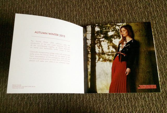
   Magazine example


   Here, my eyes go to the information and picture of the girl in the outfit.

   When I wasn't looking for whitespace the first time I glanced through the pages.
   I didn't realise the precise placement is. Everything is even and lines up.


   Shop front/billboard example


   All you think is "the big sale" when you see this sign.
   The rest of the billboard space carries little meaning other than the striking red that grabs attention.


   Billboard example


   I love the design structure in this billboard.
   The dark background shows off all the information to you.


   Website example


    A beautifully designed website, where everything is 'just so'.
    Makes you think highly of the brand, product or company :)


   TV example


   I notice how sit-coms are structured, with the plain walls, placement of props and furniture.
   The set is designed to frame the actors and though it plays a crucial part in the show.
   You aren't watching the walls and the set.
   But the show wouldn't be the same without the cool purple apartment :)


Negative space in design

   I enjoyed researching examples in this learning activity :)

    Magazine layout


   Here is an example of a magazine layout using the negative space to the looks advantage. 
   The whole space filled with the water and white background to the left. 
   It gives the design a nice flow that suits the mood.


    Website design


   This website design has so much negative space involved.
   Gives the impression of clean and profressional.
   The black space fills up with the portfolio work while the artists picture remains fixed.


     Artchitecture


   I loved looking at the pictures of this amazing Japenese modern home.
   Your eye just follows along the walls, to the edges of the building.
   The angles are visually amazing while at the same time the building incorporates so much space.


http://www.trendir.com/house-design/open-air-homes-modern-architecture-incorporating-negative-space.html


   Nature


   Behind the gorgeous Eagle, we see a beautiful landscape.
   The photographer using both the background and foreground to make a beautiful picture,
   shot at such an angle so that we can appreciate both!


    Street signage


   Road signs are important in road safety as we need to be able to see them.
   They must be both clear and legible.
   Using negative space to frame the message/image and to pop the words/image out.
   Helps the viewer to focus on the signs information.


   Vehicle signage


    We see the logo on the car door and the rest of the companies branding through the coloured
    areas on the rest of the car.


    Film example


    The first thing that came straight to mind thinking about films, are the CUBE movies.
    The actors are definitely the point of focus in these movies, yet their surroundings are a huge aspect
     relating to the films plot. In both visual and practice, the space is surely put to use in these films.


   Broadcast example


    Watching TV tonight, I saw another Advert where we see actors in a white void.
    They stand among objects and hold props, text appears to communicate to me.
    There is certainately nothing to see in this white void!
    But you tend to remember these ads. They use space for visual impact.


   Automotive design


   So much colour in areas on this car!
   Even though I see the back of the car, the wheels, the windows, the general shape......
   But the rest of the visual flat space on the car provides room for texture and gradient.


     Human anatomy


     The negative space makes up the shape of the hand, right up to the fingertips.
     Like in actual X-rays, you focus on the inside anatomy and the rest makes up the general outline.


Wednesday, 20 February 2013

Black squares activity


Using only squares to represent the given words.
I circled a few tension points in the design flow.

Tuesday, 19 February 2013

Design elements and principles


A few design elements and principles within this busy magazine.
The feel of this magazine has a horizontal direction, giving the viewer a sense of calmness and stability.

Monday, 18 February 2013

3 focus examples


Focus & hierarchy  

When I see the information on this DVD cover, there is an order to what I see first.

1) The big image of the actors stand out
2) 'Finding Neverland' movie title in the creative big text
3) The visual space in the middle of the actors
4) Text information up the top in the gold colour
5) Text information at the bottom is the last thing I see


I read this brochure downwards in information.

1) The image of the girl takes a good two thirds of the page
2) 'the feeling of salon smoothness' - relates to the image
3) Waxaway logo is the last piece of information I look at

4) The blue visual background isn't really a crucial information part, but it's another thing I noticed last in visual communciation.


This is a really busy magazine cover where I found an order of 8 pieces of communication

1) 'inplace' is very large text standing out first (as it would need to popping out of a magazine rack)
2) 'Simplify your life' is in a striking colour and in a font that is easy on the easy
3) The bathroom image (particulary the shape of the bath) captures my attention next
4) The information in orange "Moving made easy"
5) Information in the white circle
6) 'Going up?' in the gold
7) The black text on the bottom
8) The white information on the black strip at the bottom of the magazine was the last thing I looked at

Sunday, 17 February 2013

Welcome!


Hello and welcome!

Joanne is the name, I'm a student learning all I can about graphic design and media.

Today, I begin my first online Tafe course learning about media and design.
My blog will tie in closely to what I learn and become an online visual diary.

As well as this, today is also my 20th birthday and a beautiful sunny warm day.

That completes my first blog post, hoping to find using a blog very handy as a designer.