Bad type - Flyer example
The reason I don't particulary like the fonts within this flyer, is probably mainly because it's not my style.I think there are too many bold square fonts with bold colours for my taste.
I feel it is chunky and shouting information at me.
My eyes are seeing blocks of text, I'm not really wanting to read it.
But it's a small piece of work to put all the information into, so it isn't really a bad design/type.
It just doesn't really appeal to me as good type in design.

Bad type - Magazine example
I'm just really picking on 2 small things here. I feel this is bad type in design because;The hyphens! Most designers using Indesign should know to switch hyphenated words off.
I added red arrows to show where they occur... This happened through-out the whole magazine.
I'm really being picky though, but it was one of the first things I noticed.
The actual font itself is alright, maybe a little too light/thin, I would have searched for an alternative.
This article isn't overly legible. The background behind the text is too strong against the black text.

Bad type - Advert example
I guess I feel that advertising today should be looking at current type trends.Though not everyone is or needs a graphic designer for an advert.
But Jokerman is a font that I think isn't a very attractive one! And in red? No!

Bad type - Newsletter example
This newsletter is perfectly alright for what it is.Perhaps the leading in the top left and the tracking/kerning between letters in the logo could be adjusted.
I wouldn't have enlarged the first letter of each word in the logo. (H,V,Y) or it simply has been enlarged too much for my liking. Another common typeface, I'd personally steer away from.

Good type - Signage example
I love the typeface they use for Smolt logo.It has a very square feel on the letters, as if replicating the feel of the tables and signage.
Typefaces representing a business look good being modern, timeless and reflect a little about the place.

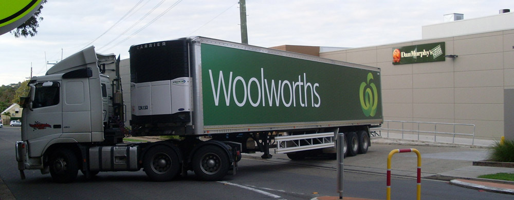
Good type - Truck example
Woolworths use a nice font that is clearly visible for their signage and vehicles.White against the dark green make it easy to read.
I love the open counters and that it's sans serif, I feel it's modern and clean.
Good type - Logo example
I love logos that used round and beautifully shaped letters.And the use of combining letters with each other, as well as ligature.

Good type - Print example
I don't mind the use of using all capital letters, using bold, or italics for expression.It allows the words on the page to carry more meaning and talk to you.
My example is basic but it's actually a nice clothing catalogue from a girly dress store in Hobart.

Good type - Less is more
No capitals, not very bold, not too thin, has serifs.But I find the typeface to be a point of focus in this album cover design.
Something must have been done right, I'm not exactly sure why I consider it to be a good font.
It's very feminine, a little curvy, suits the cover style.
Would also suit being black on a white background.

No comments:
Post a Comment