Saturday, 16 March 2013

Fifty Pumpkins


Fifty pumpkins drawing task


(From left to right)

1) Normal pumpkin
2) Pumpkin seed
3) Bowl of pumpkin soup
4) Halloween pumpkin
5) It's meant to be a 'P' with the counter as a little pumpkin
6) The top bit of a pumpkin
7) Roast pumpkin
8) Mario pumpkin
9) Top of pumpkin cut, so you can see the pumpkin mush inside!
10) Pumpkin face with the stalk as the nose!
11) Sprout
12) Love heart pumpkin
13) Smashing Pumpkins.
14) Japanese Pumpkin
15) Pumpkin pie
16) Row of pumpkins
17) Pumpkin disco ball
18) Tea cup pumpkin
19) Cartoon pumpkin
20) Pumpkin umbrella
21) From the movie 'Halloween'
22) Headphones
23) Knitted pumpkin
24) Different view
25) Pumpkin soup in a mug


26) Half a pumpkin
27) Pumpkin leaves
28) Digital pumpkin
29) Pumpkin and a crow (they love pumpkins!)
30) Pumpkin juice
31) Pile of seeds
32) Soup can
33) Slice of pumpkin
34) Apple logo. Just as a pumpkin.
35) Skull
36) Stamp
37) Pile of pumpkins
38) Creative pumpkin face
39) Different pumpkin type, cut in half
40) Meant to be like a pumpkin vase
41) Rotten
42) Half the space filled in with a pumpkin
43) Long pumpkin
44) Top down view
45) Half the space filled in with a pumpkin (different angle)
46) Literally half a pumpkin
47) Arty
48) Green
49) Drew it without taking my pen off, the start and end don't meet.
50) Back to smashing pumpkins again. Just with Nigel Thornberry 'Smashing'

Monday, 11 March 2013

Poster design


    Expressing feelings with type


     I really liked the quote 'Worry often gives a small thing a big shadow'
    I'm a person who can really relate to that!
 
    I started out looking for a typeface for the word 'Worry'.
    When I worry, I usually feel very negative. I usually listen to Evanescence :P
  
    This is a font called 'Evanescent' a clever person made on Dafont.com.
    It had a very distorted and sharp look. A bit like the overwhelming feeling of worrying.

    I left the font black and quite big, when you worry it feels huge and noticable.

    I used a calmer sans serif font in white (called Iris), to represent the factual logical text.
    I put 'small' in Italics and a few point sizes down.
    'A big shadow' is left in black with 'big' in bold, the last thing in the flow of text you read.

    The 'BIG' shadow coming from the 'small', occured to me during font searching.
    Probably my favourite feature!


    A few tweaks!


     Gave the background a softer feel, I prefer it subtle actually :)
   
The kerning and baseline in 'Worry' was also adjusted!


Thursday, 7 March 2013

Good type and bad type


   Bad type - Flyer example

   The reason I don't particulary like the fonts within this flyer, is probably mainly because it's not my style.
   I think there are too many bold square fonts with bold colours for my taste. 
   I feel it is chunky and shouting information at me. 
   My eyes are seeing blocks of text, I'm not really wanting to read it.
   But it's a small piece of work to put all the information into, so it isn't really a bad design/type.
   It just doesn't really appeal to me as good type in design.


   Bad type - Magazine example

   I'm just really picking on 2 small things here. I feel this is bad type in design because;
   The hyphens! Most designers using Indesign should know to switch hyphenated words off.
   I added red arrows to show where they occur... This happened through-out the whole magazine.
   I'm really being picky though, but it was one of the first things I noticed.

   The actual font itself is alright, maybe a little too light/thin, I would have searched for an alternative.
   This article isn't overly legible. The background behind the text is too strong against the black text.     


   Bad type - Advert example

   I guess I feel that advertising today should be looking at current type trends.
   Though not everyone is or needs a graphic designer for an advert.
   But Jokerman is a font that I think isn't a very attractive one! And in red? No!


    Bad type - Newsletter example

    This newsletter is perfectly alright for what it is.
    Perhaps the leading in the top left and the tracking/kerning between letters in the logo could be adjusted. 
   I wouldn't have enlarged the first letter of each word in the logo. (H,V,Y) or it simply has been enlarged  too much for my liking. Another common typeface, I'd personally steer away from.  


    Good type - Signage example

    I love the typeface they use for Smolt logo. 
    It has a very square feel on the letters, as if replicating the feel of the tables and signage.
    Typefaces representing a business look good being modern, timeless and reflect a little about the place.


    Good type - Truck example

    Woolworths use a nice font that is clearly visible for their signage and vehicles.
    White against the dark green make it easy to read. 
    I love the open counters and that it's sans serif, I feel it's modern and clean.


    Good type - Logo example

    I love logos that used round and beautifully shaped letters.
    And the use of combining letters with each other, as well as ligature.


    Good type - Print example

    I don't mind the use of using all capital letters, using bold, or italics for expression. 
    It allows the words on the page to carry more meaning and talk to you.
    My example is basic but it's actually a nice clothing catalogue from a girly dress store in Hobart.


    Good type - Less is more

    No capitals, not very bold, not too thin, has serifs.
    But I find the typeface to be a point of focus in this album cover design.
    Something must have been done right, I'm not exactly sure why I consider it to be a good font.
    It's very feminine, a little curvy, suits the cover style. 
    Would also suit being black on a white background.


Tuesday, 5 March 2013

Sketching layouts

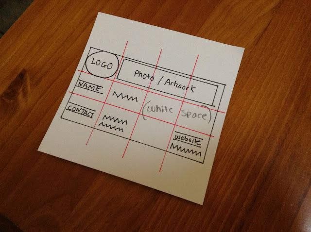
 Website layout, newsletter layout and business card layout with grids.


Improved business card layout using a grid.


Monday, 4 March 2013

Typeface panel


   Chosen type - Eras 


   A sans serif typeface, designed by Albert Boton and Albert Hollenstein.
   The font was released in 1976 by the Internation Typeface Coporation.
   It's distinct features include the 3 degree right tilt and the open bowls on the characters.

   This font includes four truetype fonts and are included in some editions of Word document. 


Gutenberg flow


Magazine cover


My eye flows from the top heading from the left, all the way down through the information to the bottom.

The cover model takes up the visual information on the right, while the text information flows down easy to read towards the centre.

I didn't take much notice of the bottom left corner nor the space at the right top.


Grid layout


Magazine layout example

This example is set out as a 3 column on one page, then to 6 guides on the second page.


 A four column layout. They used the first column for plazing an image.
 It feels like the layout has certain sections for placement of the imagery. 
 The heading is broken into two for the title and text.


Other examples using grid

Drawing or sketching using a grid, ensures an evenly balanced illustration.


    DVD menus are structured with a very clear layout.
    This one is divided into 8 columns.


  Examples not following a grid


 This David Carson design, has typography all over the place!
 The letters don't fall nicely into a column, some even reach the edge of the page.
 This may be so, because it gives the impression of what Davids style is like.


 A design piece that has a four column feel. 
 Due to the letter sizing running into the columns, it doesn't fall into place.
 The larger letter make the design visually interesting, a squashed feeling.